How to Choose Eyeshadow Colors for Your Coloring
Build a small eyeshadow combination around your skin depth, preferred undertone, and eye color. Includes three shade roles, placement, and troubleshooting.
On this page
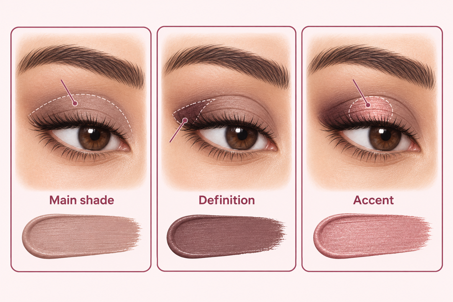
Give each shade a job
Start with a main lid color, a deeper shade for definition, and an optional accent. Choose depth against your own skin and the contrast you enjoy. Eye color can suggest an accent, but it does not choose the entire palette. A single-color look can also be complete. To plan the eye alongside cheek and lip colors, try the free makeup quiz and adjust its suggested palette.
Use eye color to shortlist an accent
Charlotte Tilbury describes neighboring colors as a route to harmony and contrasting colors as a route to emphasis. Treat both as creative options. Keep the main shade similar while testing one accent:
- Blue eyes: compare copper or bronze with slate or blue-gray.
- Green eyes: compare plum or burgundy with olive.
- Brown eyes: compare bronze or copper with plum or navy; brown has no single exact opposite in makeup.
- Hazel eyes: echo a visible gold-brown or olive tone, then compare a plum accent.
Build a small combination before adding colors
‘Main color’ means the shade doing most of the lid work, not a mandatory pale beige. A shade can be a subtle wash on one complexion and a strong light accent on another. The combinations below show roles; adjust the real formula’s depth, finish, and amount.
Explore the labeled color swatches
Soft and cooler
- Base: taupe
- Define: plum-brown
- Accent: muted rose
A taupe wash, plum-brown definition, and a muted rose accent.
Warm and earthy
- Base: warm brown
- Define: deep brown
- Accent: copper
A brown wash, deeper brown definition, and a copper accent.
Deeper and cooler
- Base: cocoa-taupe
- Define: aubergine
- Accent: berry
A deeper neutral wash, aubergine definition, and a berry accent.
Test color and placement separately
Use products intended for the eyes, clean tools, and label directions. A lip or cheek formula is not automatically suitable for eyes. Stop using a product that irritates; seek medical advice if irritation persists, as the FDA recommends.
- Apply a small amount of one familiar eye neutral to the mobile lid as directed. Check with eyes open in your usual mirror position.
- Decide whether you want more or less contrast. If it looks pale, compare a deeper neutral; if orange, compare a less warm brown at similar depth.
- Add a little deeper shade near the external outer upper lash line, following the product directions. Keep the main lid shade visible.
- Try one accent on a small area of the visible lid. Compare another accent on a different occasion while keeping the main and defining shades similar.
- Save the colors and placement. Note what remains visible with your eyes open, and assess shimmer separately from its underlying color.
Worked example: copper feels too orange
Suppose a full copper lid feels much warmer than the rest of your makeup. Keep the lip and cheek, then try a taupe main shade with a smaller copper accent. That tests area and placement without replacing the palette.
If the small accent still feels too warm, compare a less warm bronze at similar depth. If the reflection is the problem, compare a less reflective finish. The next step follows what you see rather than an eye-color rule.
Troubleshoot the effect you actually see
- Ashy or pale: compare depth and the formula’s base color; a deeper taupe can differ from a pale gray shimmer.
- Muddy: try fewer overlapping colors and less blending across the whole lid.
- Accent disappears: check placement with eyes open before adding more pigment.
- Too much overall contrast: simplify either the eye or the lip intensity for the next comparison.
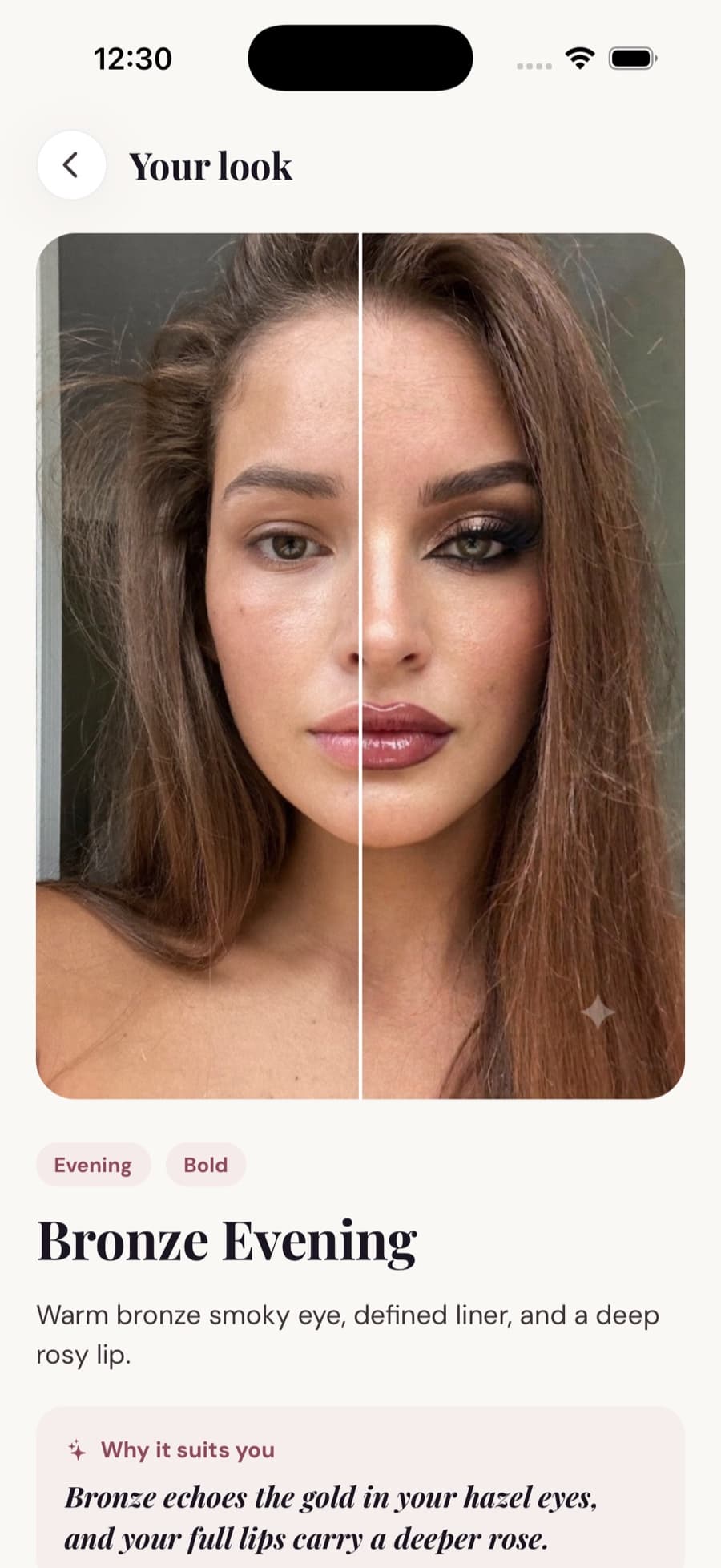
Turn the colors into a plan with Glowmi
Glowmi suggests eye shades and complete looks with tutorials. A preview can help choose a direction; confirm placement, finish, and comfort with real eye products. Then review a consistent finished-look photo.
Glowmi is on iOS. Onboarding shows a season, first shade, and first look. Pro unlocks the full experience afterward, with no free trial and daily/monthly AI limits. See the App Store for current plans.
Sources and further reading
Brand references describe their own methods and products. Our worked examples are illustrative, not records of product tests.
- Charlotte Tilbury: the eyeshadow color guide
Describes the brand’s use of neighboring colors for harmony and contrasting colors for emphasis. We use that styling distinction without adopting its promotional claims or promising a change in eye color.
- FDA: eye cosmetic safety
Supports using products intended for the eye area, clean tools, avoiding shared cosmetics, and stopping use if irritation occurs. It does not endorse our color combinations.
- Glowmi: how the face scan works
Explains our app’s color guidance and photographic limits. App previews are not physical pigment, comfort, or wear tests.
Keep reading
What Makeup Colors Suit Me? Build Your Personal Palette
Find eye, lip, and cheek colors you enjoy wearing together. See a Glowmi color-season example, compare real products, and build a personal makeup palette.
Virtual Makeup Try-On: Preview Makeup on Your Own Face
Preview makeup on your own face before applying it. See Glowmi’s before-and-after example, compare looks, and turn a preview into a real makeup plan.
Makeup Look Feedback: How to Improve a Finished Look
Review a finished makeup look with a clear brief, consistent photo, and one useful adjustment. Includes a checklist and example feedback notes.