Cool vs. Warm Blush: How to Match Blush to Your Undertone
The same blush shade can look like a natural flush on one person and a costumey patch on another, even at the same depth. Learn why cool and warm blush families clash with undertone, plus a 5-minute cheek test to find yours.
The short answer
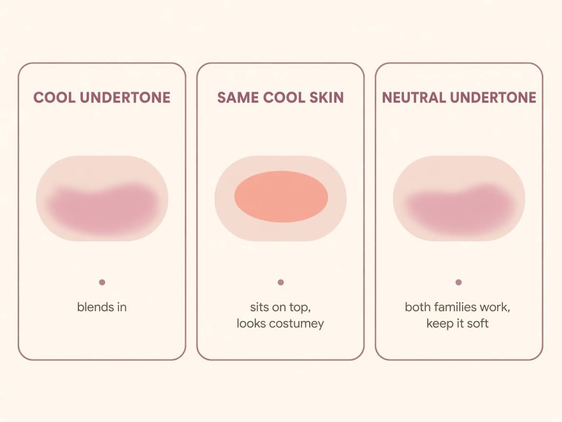
If a blush color looks like a natural flush on someone else and slightly costumey on you at the same depth, the amount is usually not the problem—the temperature is. Cool undertones tend to read most naturally in cool blush families (rose, berry, mauve, cool pink). Warm undertones tend to read most naturally in warm families (peach, coral, terracotta, warm pink). Neutral undertones can usually wear either family, but still look best keeping it soft rather than saturated.
Before you decide a blush is “wrong,” test it on your actual cheek in daylight—not on the back of your hand, and not under a ring light or bathroom bulb. A blush that fights your undertone can still look like a flush from three feet away and read as slightly off (dusty, bruised, or sunburnt) the moment someone looks closer or it shows up in a photo.
Why the same blush color goes wrong on different people
Blush sits on top of your skin's own color, and your undertone is already doing color work underneath it. A cool, pink-based blush layered over a cool undertone reads as a deeper, more saturated version of a flush your cheeks already make on their own—when you are warm, cold, or a little embarrassed. The same cool pink over a warm or olive undertone has no warm undertone underneath to soften it, so it can sit as a separate pink oval on top of gold or peachy skin instead of blending into it.
The reverse causes the opposite problem: a warm, peachy-orange blush over a warm undertone reads as sun-kissed, but the same shade over a cool undertone can read as sunburnt or rusty, because there is no warm base underneath asking for that color. This is the “costume” effect people describe—the blush is not too much, it is fighting the undertone it is sitting on.
Buying decisions make this worse in two common ways. First, trending shades are usually shown on the influencer's own undertone in their own lighting, which tells you almost nothing about how that color will sit on yours. Second, formula matters: a warm-leaning cream or liquid blush can oxidize and shift even warmer as it sets, the same way some foundations and concealers do, so a shade that looked soft in the pan can read stronger an hour later.
A 5-minute cheek test you can do before you buy
You need two or three blush options you are deciding between—in-store testers work fine, or shades you already own—and a few minutes near a window.
1. Find your most honest reference color first: gently pinch the apple of your cheek for a few seconds, or step outside for a minute, then look at the natural flush in daylight using a mirror (not a photo, which shifts color). This is the color your own skin makes at full saturation, and it is a better reference for blush than wrist veins or jewelry, which are better suited to foundation and jewelry questions, not cheek color. 2. Swatch two candidate blushes directly on the apple of your cheek, in separate thin patches side by side—do not blend them into each other yet. Use daylight from a window, not overhead bathroom lighting. 3. Blend each patch on its own side, step back, and look for which one disappears into the shape of a natural flush versus which one still reads as a distinct colored oval whose edge you can trace. 4. Compare each blended patch to the pinch-flush color from step 1. The one closer in temperature—pink versus peach or orange—to your own natural flush is your family, even if the exact depth needs adjusting up or down. 5. Check both patches again later under a warm lamp, since that is when you are more likely to actually wear blush out. A slight warm shift under lamp light is normal, not a failed match.
Failure cases to watch for: testing on the back of your hand instead of your actual cheek, which often reads a different depth and can mute undertone differences you would otherwise catch; applying a lot of a slightly-off blush and blaming placement or blending instead of the color family itself; choosing a shade purely because it looked good on someone with a different undertone in a video; a warm blush worn heavy on a cool undertone reading sunburnt rather than sun-kissed; a cool blush worn heavy on a warm undertone reading bruised or flu-ish rather than flushed; and trusting a cream blush's color in the compact without waiting a few minutes to see how it settles on your skin.
Where Glowmi fits in
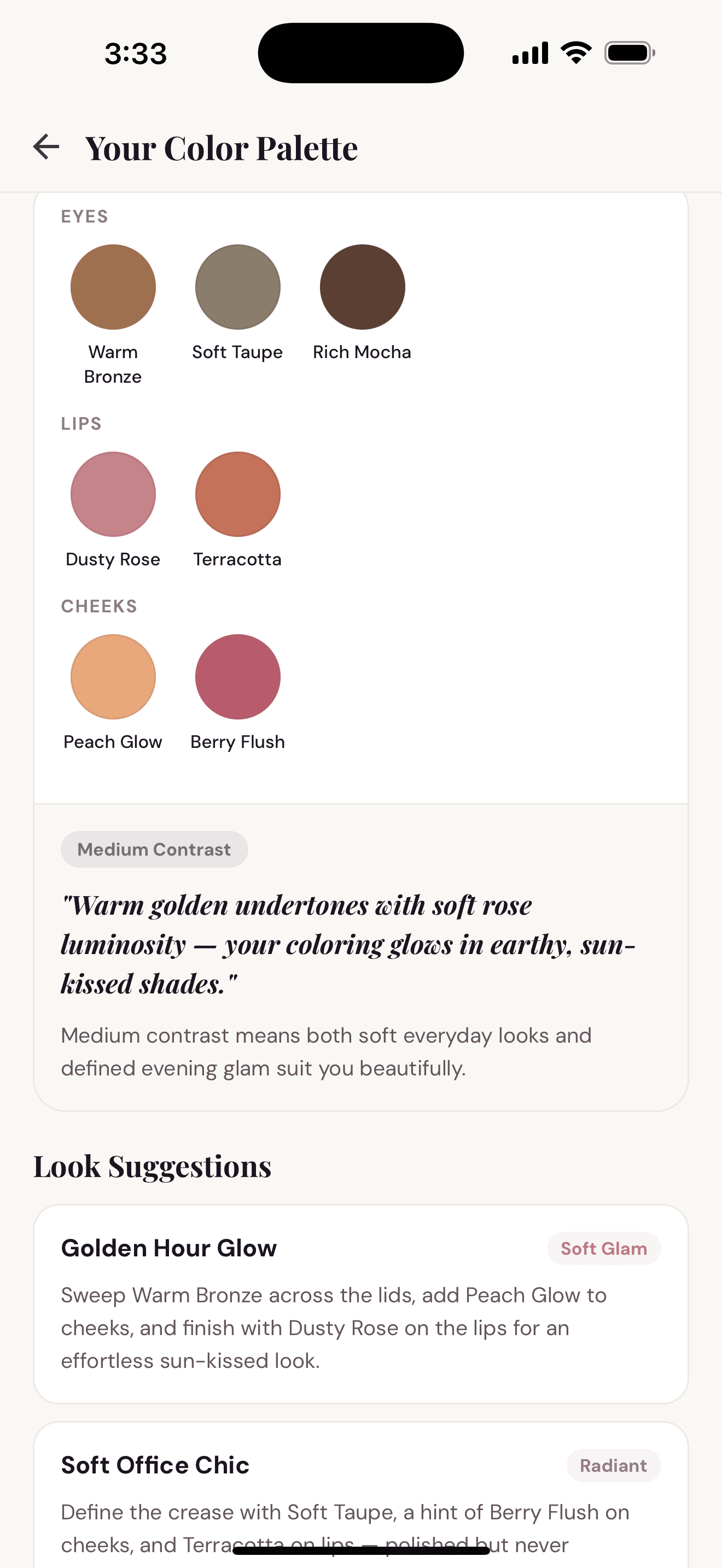
Glowmi's Skin Analysis reads your visible undertone from a bare-face selfie, and Color Palette turns that into eye, lip, and cheek directions—so you get a cool or warm blush family shortlist before you stand in front of a wall of options.
It does not replace the cheek test above, and it is not a medical diagnosis or a guarantee of one exact bottle across every brand; treat it as a faster starting point, then confirm the actual shade on your own cheek in daylight the way this guide describes. After onboarding, the full palette experience is part of Glowmi Pro, with fair daily and monthly usage limits and no free trial. Glowmi is iOS only.
Keep reading
What Is Skin Undertone? A Practical Guide for Makeup
Skin undertone is the cool, warm, or neutral hue under your surface tone. Learn how it differs from skin tone and how to use it when choosing foundation, blush, and lips.
How to Find Your Foundation Shade Without Guessing
Match foundation by depth and undertone first, avoid common mismatches, and use Glowmi’s skin analysis as a smarter starting point.
How to Build a Personal Makeup Color Palette
A personal makeup color palette is a shortlist of eye, lip, and cheek directions that flatter your tone and undertone—plus how Glowmi builds one from skin analysis.